
This tutorial is designed for students who are new to the field of data visualization. In it you will learn
- What data and data visualization are, and what makes them “good”
- What kinds of historical questions could be answered by gathering data either from archives or in person
- What is the benefit of using a spread sheet rather than a word doc?
- Practice creating a graph from a sample sheet of data
- Resources
What is (Good) Data and Data Visualization?
Data is a compilation of facts that historians can use to support arguments about a culture or how that culture changed over time. Data visualization is the art of representing data in graphic or visual form. Being able to visualize that data effectively for readers can help make your argument more persuasive but it can also help you refine the questions you are asking.
Here are some sample ways that scholars have visualized data:
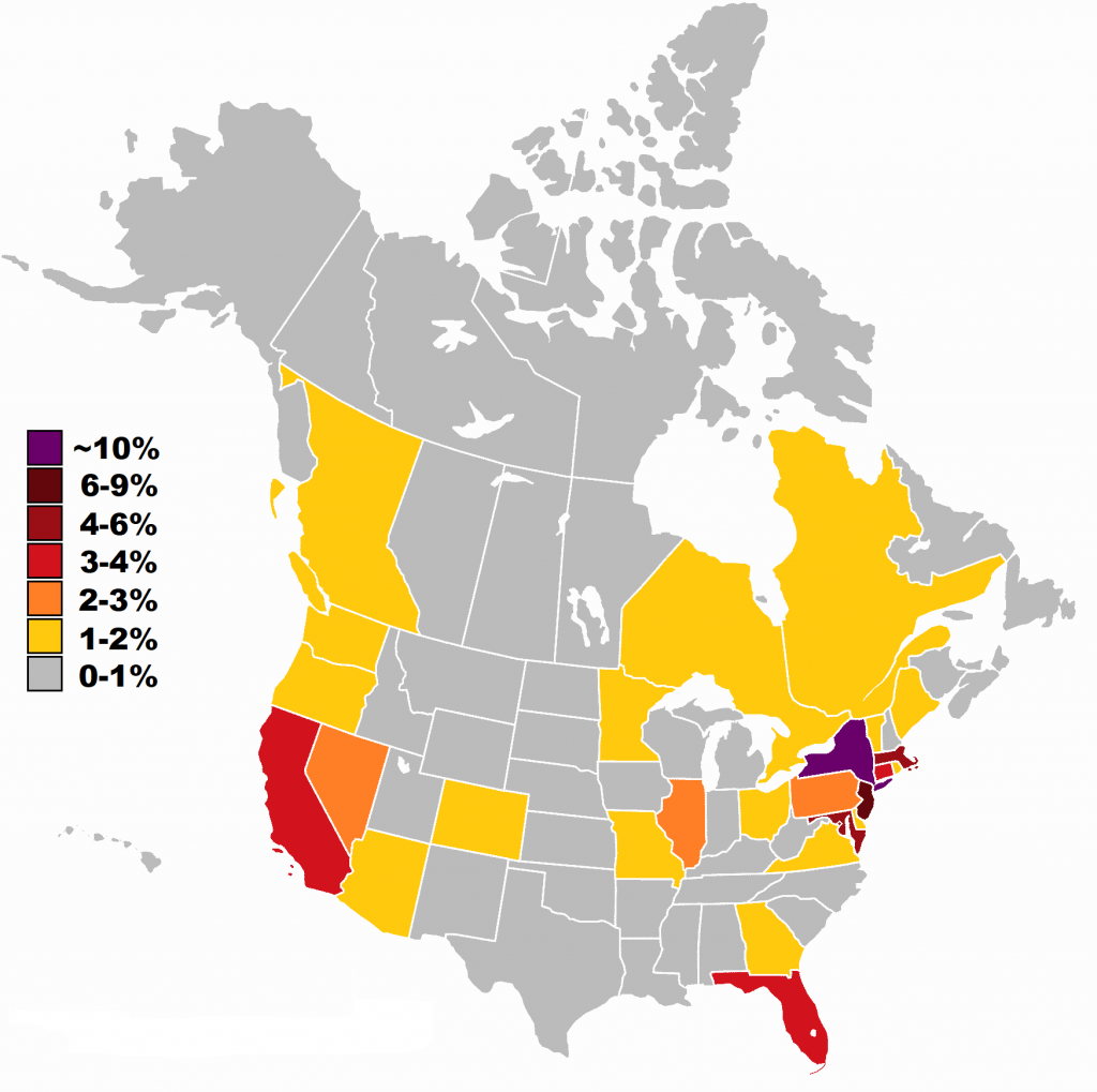
Although the information in the map above could have been presented as a table, the colors here allow us to quickly pick out where are the “hot” regions for density of Jews. Moreover, the person who designed this table was clever as they used darker, more intense colors to indicate more people and lighter colors to indicate fewer people. This makes the map more intuitive to read at a glance (more is more, less is less!).
Charts can also help scholars understand trends in the field. For example, below is a chart that plots the articles published in the journal of American Jewish Historical Society mentioned the word “Inquisition” by decade since the organization’s journal began in 1894. Seeing this information visually might lead us to wonder, why was the Inquisition less interesting to scholars in certain decades such as the one beginning in 1934 or 2004?
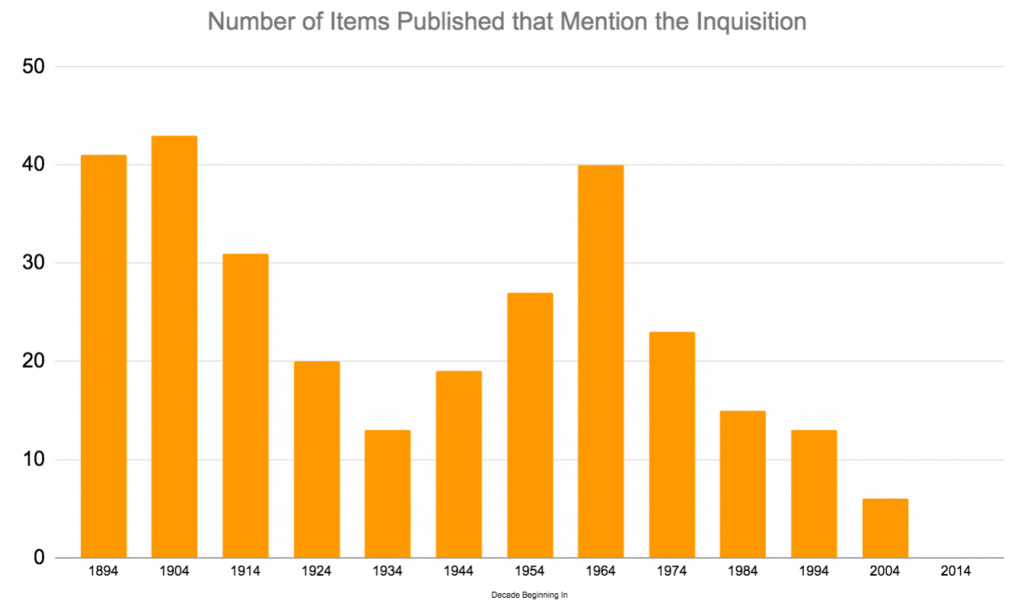
While interesting, the above chart is also bit deceptive as we don’t know how many items were published in the journal overall in each decade. For example, what if the lows in 1934 and 2004 were just because very little was published that decade? This chart corrects for some of those problems by switching from absolute numbers to percent:
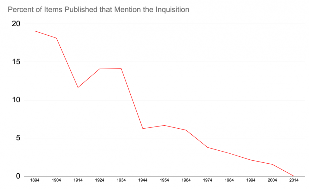
Wow! now we can see that while the “downturn” in interest in the Inquisition in the 1930s was actually just because of the decrease in items published that decade whereas the decrease in interest after 2004 was real. Very helpful.
Data visualization is “good” when it helps us see trends that are less visible when the data is just given to us as a list. Data visualization is even better when it uses colors appropriately, as we saw in the map. Finally data visualization is best when it doesn’t distort information as in the second chart about the journal.
Looking for more tips for how to make better visualizations? See Danielle Szafir’s “The Good, the Bad, and the Biased: Five Ways Visualizations Can Mislead (and How to Fix Them). Interactions 25, no. 4 (2018). https://interactions.acm.org/archive/view/july-august-2018/the-good-the-bad-and-the-biased
Data visualizations can be used to support arguments, but they are equally important early on in research, as they can help us ask better questions about the data we have found.
What kinds of historical questions could be answered by gathering data either from archives or in person?
Above we saw two examples of ways that historians can use data and data visualizations: for understanding populations and changes in the field. Data visualization is also helpful, however, for understanding other changes over time, for example in Jewish objects such as gravestones.

Lopez (1762). Courtesy
of the Jewish
Atlantic World Database.
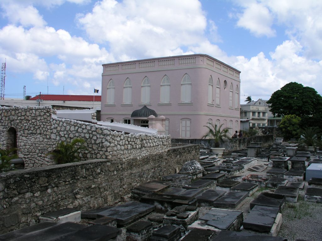
Let’s say you want to make an argument about how Jewish cemeteries changed over time. Maybe you start with an observation. For example, you noticed when you visited (in person or online) the early Jewish cemetery in Newport, Rhode Island that it looks like some of the stones have angels on them. That strikes you as odd: what about the second commandment that prohibits making representations of things in the heavens above?
Thou shalt not make unto thee a graven image, nor any manner of likeness, of any thing that is in heaven above, or that is in the earth beneath, or that is in the water under the earth; לֹא-תַעֲשֶׂה לְךָ פֶסֶל, וְכָל-תְּמוּנָה, אֲשֶׁר בַּשָּׁמַיִם מִמַּעַל, וַאֲשֶׁר בָּאָרֶץ מִתָּחַת–וַאֲשֶׁר בַּמַּיִם, מִתַּחַת לָאָרֶץ
Shemot [Exodus] 20:3
But you also noticed the later gravestones don’t have any angels. Why did people think it was ok to include angels? Why did they stop? Did the early Jews of Newport only include angels for certain people? If so, which ones?
Step one in answering these questions would be to collect data about the cemetery. But what are some of the best ways to keep track of information you collect?
What is the benefit of using a spread sheet rather than a word doc?
Probably the most obvious way to keep track of the data you collect is to make chart using a word document like the one shown below.
But, if you were to enter your data into spreadsheet such as excel or google sheets instead of a pdf or a word doc, you would be doing yourself a huge favor. Why? First, spread sheets allow you to sort the data you entered so that you can test theories. For example, are men more likely to have graven images than women? What about children? Just add a row to your spread sheet and sort accordingly.
Although the above preview only allows you to view the data, in the video below you can see how if you were the owner of the spreadsheet you could resort the data based on different attributes such as era, gender, or age by clicking at the top of any particular column of data. This function allows one to easily see if the presence of iconography correlates to any of these factors.
The second benefit of working in a database rather than a word doc is that both excel and google sheets allows you to automatically create a visual representation of your data. Here is a quick tutorial on how to do that:
Practice creating a graph from a sample sheet of data
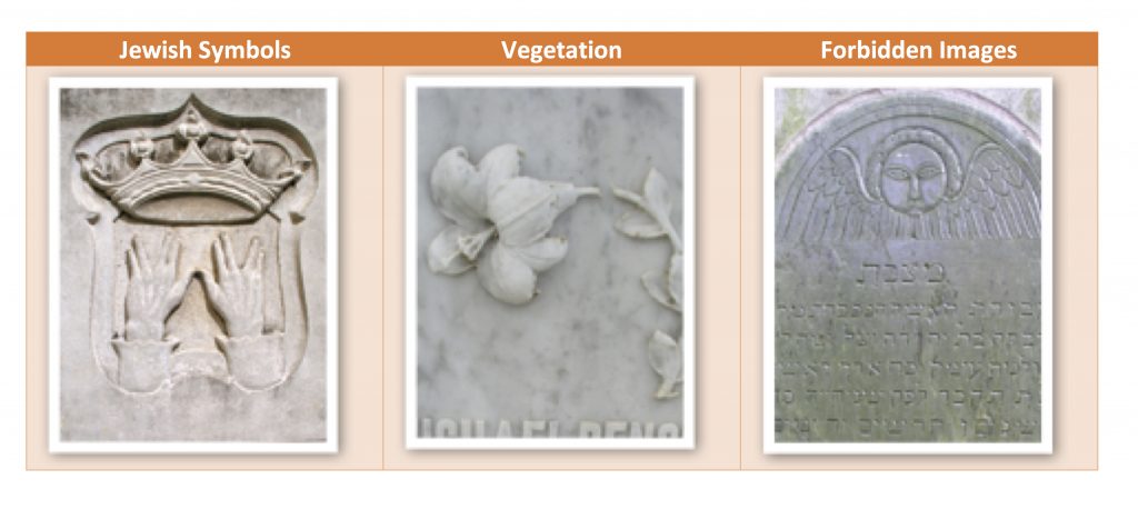
Now it’s your turn! Here is a set of data from three Jewish cemeteries (in Jamaica, St. Eustatius, and Newport) that has already been cleaned up and tabulated. In it, the type of images found on the gravestones have been divided into no iconography (images), jewish symbols (books, menorah, Star of David, hands of the Cohenim), vegetation (plants, trees, flowers), and forbidden images (angels, stars, sun, moon, hand of God).
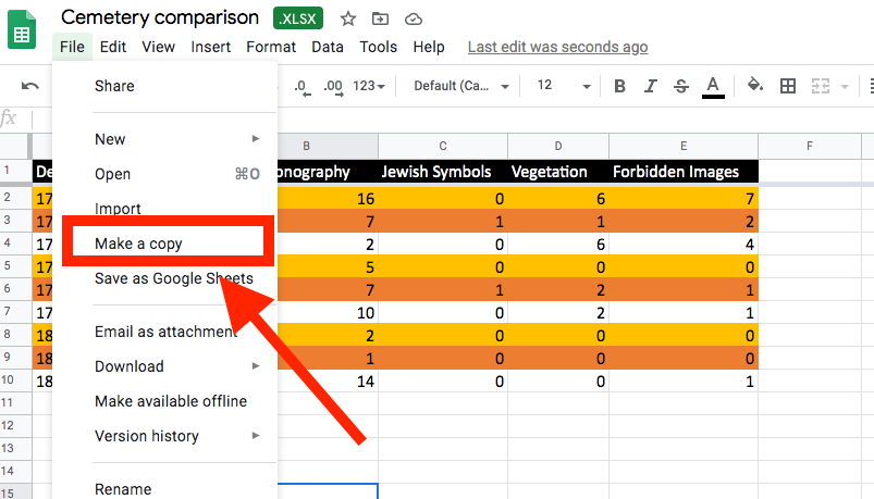
To use the data and make charts from it, click “Open With > Google Sheets.”
Then go to the top left and select File > Make a Copy and then save it to your own google drive.
Now you should be able to use the directions in the video tutorial to create some charts!
When you are done, write a brief paragraph about what the charts tell us or don’t tell us. What questions do you have about the gravestones and cemeteries now that you see the visualization?
Want to dig deeper to begin to answer your questions? Check out gravestones from different early American Jewish cemeteries here. The images include the full set of stones from the Touro Cemetery Newport and the Hunts Bay Cemetery in Jamaica.
Resources
Cairo, Alberto. The Functional Art an Introduction to Information Graphics and Visualization. Berkeley, CA: New Riders, 2013.
Cairo, Alberto. The Truthful Art: Data, Charts, and Maps for Communication. San Francisco: Pearson Education, 2016.
Posner, Miriam. “Data Visualization.” Introduction to Digital Humanities.
http://miriamposner.com/classes/dh101f17/tutorials-guides/data-visualization/
Szafir, Danielle. “The Good, the Bad, and the Biased: Five Ways Visualizations Can Mislead (and How to Fix Them). Interactions 25, no. 4 (2018). https://interactions.acm.org/archive/view/july-august-2018/the-good-the-bad-and-the-biased
Tufte, Edward R. Beautiful Evidence. Cheshire, CT: Graphics, 2006.
Tufte, Edward R. Envisioning Information. Cheshire, CT: Graphics, 1990.